United Photoshoot: Pamela Mangroelal, Miss India Suriname 2008
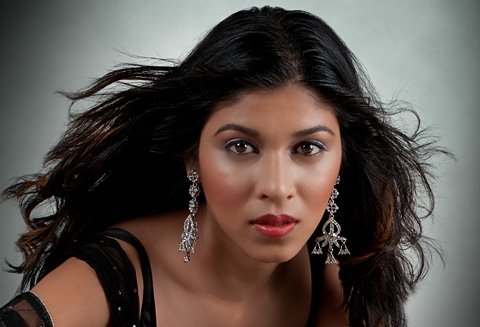
Pamela Mangroelal, Miss India Suriname 2008
I was contacted by Edward Lee, editor of United Magazine, a few months ago to do some pictures for a feature he was planning for the August 2009 edition of the magazine (which should be out in Suriname and The Netherlands within days). There would be an interview with Pamela Mangroelal, who was crowned Miss India Suriname 2008 last year, and he wanted some exciting visuals to go with it. Being the creative person he is, he already had a concept in mind. Since Pamela is an avid chess player he thought it would be nice to do something involving chess. The details of what exactly we would do were left to me.
I spent quite some time thinking about it in the following weeks. I knew that I wanted to do something challenging for me, but it had to stay within the amount of time I had allocated for this project. I started looking for chess sets with interesting looking chess pieces that I could use in pictures with Pamela. I quickly decided that I wanted to use glass chess pieces, but it was difficult to find glass chess sets with chess pieces that looked sophisticated enough and didn’t cost a fortune. At the same time, I started experimenting in 3D Studio Max to see if I would be able to create the chess pieces in 3D and combine them with the pictures I would take of Pamela later in post production. As I was experimenting I soon decided that I would just do the chess pieces in 3D, not only because they would look much more detailed, but also because it would give me a lot of flexibility in terms of what I could do with them later when combining them with pictures.
The next step was deciding which pictures I wanted to deliver to United. I came up with 3 pictures. First, I wanted to feature Pamela with a normal size glass chess set, kind of a portrait to open the feature with in the magazine. Then, I wanted to do a picture where she’d be standing on a really big chess board, with chess pieces as big as her. The idea here would be to replace the white queen with Pamela. And finally, I wanted to do an image that would feature Pamela with the chess pieces on a really grand scale. I was thinking along the lines of scenes from Lord of the Rings, putting her in charge of incredibly large chess pieces on a large battlefield. I had some other ideas in mind too, which I would use as a backup plan just in case something went wrong with the others, but I won’t discuss them here.
Once I was sure which results I wanted in the end, I started building the scenes in 3D Studio Max and doing some tests to a point where I was sure that I would be capable of executing what I had planned. Time was running out so I met with Pamela and discussed the plans I had for the pictures with her and did an initial test photoshoot. The purpose of the test photoshoot was to get to know her a little better and get a feel for working with eachother before the actual photoshoot, and also to get some material I could use to see if I would be able to pull off what I had in mind. By using these initial pictures with various poses, I could narrow down which poses and angles would work better and then really focus on those during the real photoshoot.
With the deadline fast approaching I made final preparations for the photoshoot, got the material I needed (background, a real glass floor to get realistic reflections etc.) and discussed with Pamela what kind of clothes I wanted her to wear during the photoshoot. We weren’t able to find exactly what I was looking for but I decided to work with what we had. I teamed up again with Euvie Karijoredjo for the makeup, hair and styling. It is really wonderful to work with people who know exactly what you want before you explain it to them by just looking at a concept image, and Euvie and I seem to have that kind of an understanding.
I have to admit that I was a little nervous on the day of the photoshoot. Everything was planned, I was confident I thought of everything and would be able to pull off what I had in mind, but you’re never sure until you have the final results in front of you. Below are some pictures of the setting as it was during the photoshoot:
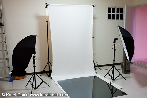
The setup
As you can see the setup was fairly simple. White background with extra reflective glass on the floor. I used the glass to get the most realistic and accurate reflection on the floor so I could use that in post production for the reflection on the glass chess board etc. (instead of just vertically mirroring the model and fading it to make a reflection, which doesn’t look good). I used two Canon 580 EX II flashes as the light sources triggered wirelessly by a ST-E2 mounted on the camera. Works really well in-doors but probably not so reliable out-doors. During this photoshoot I used a Canon EOS 40D body with the Canon EF 24-70mm f/2.8 L USM lens. Both excellent performers.
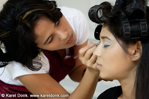
Euvie doing the makeup, while looking like a model herself
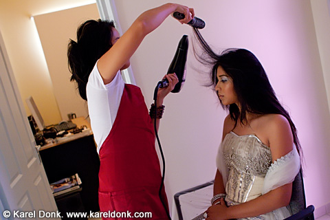
Hair…
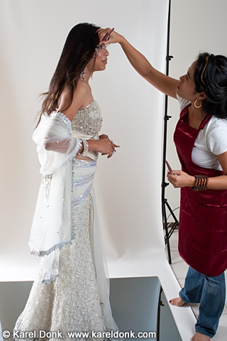
“Wait, wait! Need to fix this before you start.”
Edward dropped by at the beginning of the photoshoot for a short while, probably to make sure I was treating the ladies well. I don’t know why I didn’t think of taking some pictures of Edward, otherwise I would have posted one here. Sometimes I take things too serious and forget to have fun. 😀
The photoshoot went well, it lasted for about 5 hours with some breaks in between. I had just about enough time to get what I want, it’s amazing how time flies during photoshoots. After the photoshoot I had to start looking at all the images and select which ones I’d use for the final pictures. For two of the final pictures, I ended up combining 2 to 3 pictures of Pamela just so I could have her pose and expression just right. Then I brought the pictures into 3D Studio Max scenes to combine them with the rest of the digital images.
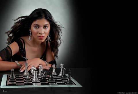
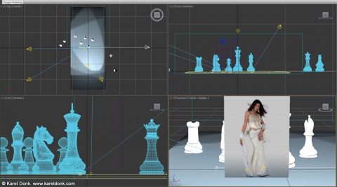
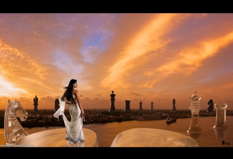
Above you can see the first image created for a 2 page spread. The article text is supposed to go on the right side. If you look at the larger version you can see the amount of detail that you can get from a 3D rendering program such as 3D Studio Max. Even the tiniest reflections are rendered accurately in the glass chess pieces.
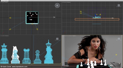
In the screenshot above you can see how the scene for this picture was set up. Rendering this scene with acceptable quality and resolution took almost 24 hours on my computer. So you can imagine the amount of time that went into creating the final image when you have to do test renders, tweaking and additional post production after rendering.
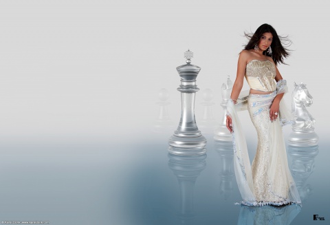
In the second image above the idea was to have Pamela pose as the white queen. Originally I wanted to put her on a big chess board but during test renders the black and white squares and reflections were a bit too distracting for what I was aiming for and gave the whole a chaotic look. At least in my opinion. So I decided to just replace it with a glass floor giving the whole a much simpler and elegant look. Again the image here is for a 2 page spread, and the text is supposed to go on the left side.
The screenshot above shows the scene setup in 3D Studio Max.
And then the final image, visually the most exciting one of all 3 images in my opinion. The idea here was to have Pamela control the white chess pieces on a large battlefield. For the background I chose to use a panoramic picture of Paramaribo (the capital of Suriname) taken just after sunset from the J. A. Wijdenbosch bridge which I had taken a few months ago along with many other shots. The dramatic looking clouds were really as they appear in the picture that day and were not digitally created. By using Paramaribo as the background and setting for this image I thought United’s audience would be able to identify more with the image. Pamela is standing on the top of a Knight, which is standing in the water in the Suriname river. Looking at this picture, I imagine the camera flying in from behind slowly coming closer to Pamela, with her hair moving in the wind – that would make a very dramatic looking scene in any film.
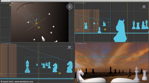
The scene setup in 3D Studio Max can be seen in the above image. I think it’s obvious that most of my time went into creating this picture. I tried to get the lighting as realistic as possible and the reflections as accurate as possible.
Looking back I’m fairly satisfied with the end results, and I’m hoping everyone else will be too. Given more time, resources and much better equipment I’m sure I would have been able to create better looking images. Often it’s not easy to explain to clients why you need so much time to do something that may seem so simple to them. For these images alone I spent quite some time during the creative process just thinking about ideas, making concepts, and trying different compositions etc. before starting with actual production. And often clients also don’t realize the investments you have to make in the right tools among other things to be able to do the job, all of this resulting in higher costs for the end results.
With these kinds of posts on my blog I’m trying to give people a glimpse into the process that goes behind this kind of work. I hope you’ve enjoyed it. Be sure to get the latest United and check out the interview with Pamela.
Update September 21, 2009: The pictures have been printed a little too dark in the magazine unfortunately. You will see that especially ‘The Queen” is too dark when compared with the version here on my website. This was caused totally out of my control due to a colormanagement issue at the press.

Comments
There are 30 responses. Follow any responses to this post through its comments RSS feed. You can leave a response, or trackback from your own site.