The QuantumGate logo
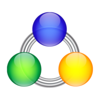
 When I first got the idea to develop QuantumGate back in 2006 I designed a logo for it that I could use in communications and in the software that I began working on at the time. The idea I had was that I wanted to show a couple of connected peers in the logomark, and the image that came to mind was what you can see on the right. There was no process behind it and no reasons for the proportions used. I just had the strong intuition that I had to use three circles connected to each other in that triangular arrangement. I wasn’t satisfied with it but I used it and figured I would revisit it again in the future.
Fast forward to 2018, and now I know where the original idea came from. It turns out that the arrangement I used very closely resembles the fundamental geometry behind our reality which I described in details in my 2015 post “The Cycle of Life”. Back in 2006 I couldn’t tell why I wanted to use a design as seen above; it just came to me intuitively and I knew that this is approximately what it should be. But now I know exactly why.
With that knowledge I decided to redesign the logo based on the actual proportions of the fundamental geometry of the universe as seen below. The red circle is a special one because its circumference is equal to the circumference of the black triangle, and together they create the golden ratio (φ) as I discussed in a previous post. It’s no coincidence that they can be seen together in the image below.

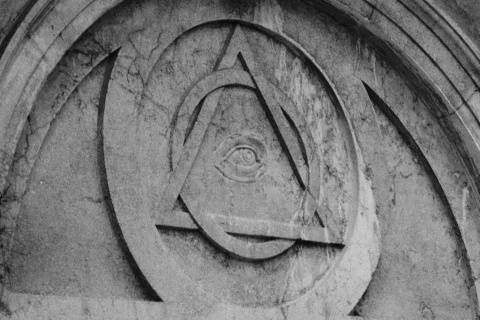
The All Seeing Eye on the Church of St. Magdalene in Venice (Photo by gnuckx)
From there I took 3 of those red circles and placed them around the triangle such that their center points are on each of the points of the triangle. Notice how they align precisely along the petals of the flower inside the seed of life in the center.
Then I placed the letter Q in the inscribed circle of the black triangle.
The Q is not only the first letter of the name QuantumGate, but it’s also supposed to represent the “All Seeing Eye” in the middle of the triangle. And this is done on purpose, especially if you realize the significance of it. In this case it looks more like a geometric Eye of Horus.
Taking out all the supporting geometry we are then left with the below image, which closely resembles my initial idea from 2006 above.
I decided to keep the three circles that represented the connected nodes in my initial design in an abstract way by just keeping the intersections with the circles in the middle. That way we end up with the image below which looks like a portal or gateway that you might see in sci-fi movies with the Q or eye in the middle.
The portal/gateway theme is something I intend to use often because that functionality is one of the fundamental features of QuantumGate. For example in the image below (click for larger version) you can see the geometry in the background folding into a wormhole that you can go through and reach another destination.
This is basically the idea behind the relay functionality in QuantumGate. The relay functionality allows opening gateways within gateways in a recursive/fractal manner.
And finally, the font used for the logotype is Xirod.
So now I feel that I have the fundamental philosophy behind QuantumGate represented in its logomark and it’s aligned with the goals that I have for it, which all boil down to freedom for the individual and respect for their universal right to life. Be sure to read my posts “All Seeing Eye” and “The Cycle of Life” if you’d like to know more.


Comments
There are 0 responses. Follow any responses to this post through its comments RSS feed. You can leave a response, or trackback from your own site.